/ 02 of 05
Type
· 2025
Valk Grotesk
Client
Self-initiated, released with the foundry Lettervorm
Year
2025
Discipline
Type
Scope
Typeface design, specimen, release materials
With
Lettervorm (release), Joke Wiersma (spacing)
A grotesk drawn for posters, tested on posters and priced like a tool: three weights, one idea, no ornament.
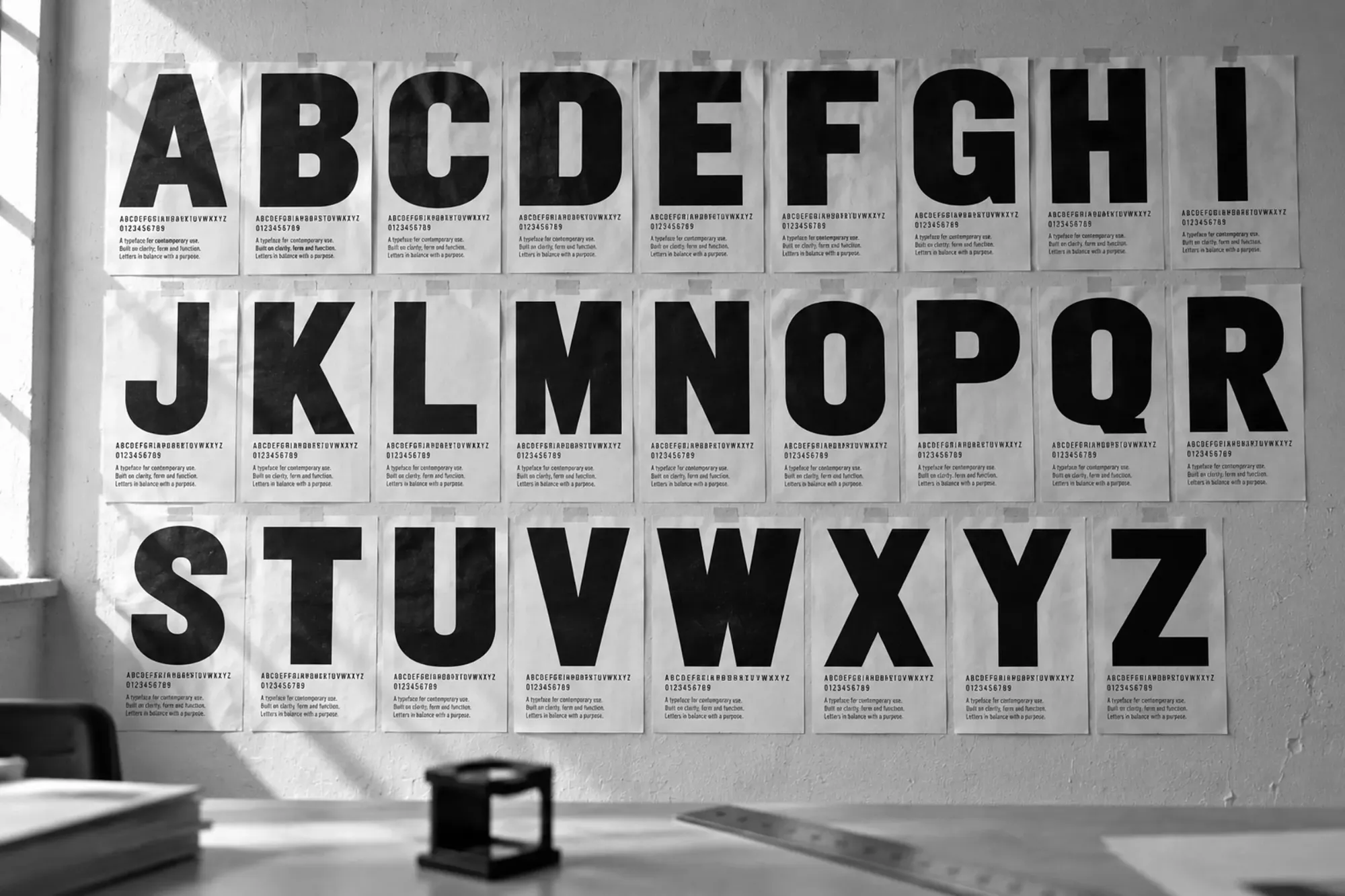
Fig. 1 The first specimen sheets, A3, taped to the studio wall for proofing.
Brief
For years I redrew the same condensed capitals by hand for other people’s posters. In 2023 I decided to stop borrowing and draw one properly: a grotesk that stays dense in capitals, stays even in a paragraph, and still reads at 9 pt on a programme leaflet.
Approach
The capitals came first, drawn 400 mm tall on A3 sheets taped to the studio wall and judged from across the room, because that is how a poster is read. The lowercase came last. Joke Wiersma spaced and kerned the three weights, and the Black is drawn narrower than the Regular so that a line of it fits where a line of Regular would not.
Result
Lettervorm released Valk Grotesk in October 2025 with three weights, 612 glyphs and support for 41 languages. It sets the Kade Film Festival posters. The specimen was printed as a 16-page newspaper in an edition of 600.
3 weights
612 glyphs
41 languages

Fig. 2 Specimen poster, 50 × 70 cm: the R of the Black.

Fig. 3 The Regular at 9 pt, photographed through a loupe.